文章目录
- 取消标题栏
- 初始页面(load)
- 设置为竖屏
- 自定义标题
- Tabs&TabContent
- Tabs
- 通过divider实现了分割线各种属性
- 图片下载
官方文档
@Entry
@Component
struct Index {
  @State message: string = 'Hello World'
  @State djs:number = 5
  build() {
    Column(){
      Navigation(){

      }.title("go to")
      Row(){
        Text(this.message).fontSize(20)
      }.width('100%').height('5%').backgroundColor(Color.Red)
      Row(){
        Text(this.message).fontSize(20)
      }.width('100%').backgroundColor(Color.Blue)
      Row(){
        Text(this.message).fontSize(20)
      }.width('100%').backgroundColor(Color.Blue)

      Stack({
        alignContent:Alignment.Bottom
      }){
        Text(this.message).fontSize(20)
      }
    }.height("100%").width('100%')
  }
}
注意:这样写其中Row的一些内容是不会呈现的,可以不用。要写也是写在
NavigationNavigation里面
@Entry
@Component
struct Index {
  @State message: string = 'Hello World'
  @State djs:number = 5
  build() {
    Column(){
      Navigation(){

      }.title("go to")
    }.height("100%").width('100%')
  }
}
但是你会发现还是有标题栏

取消标题栏
- 打开你的HarmonyOS项目的配置文件
config.json。 - 定位到你想要修改的页面配置部分。
- 在
metaData对象中添加customizeData数组,其中包含一个对象,该对象的name属性设置为hwc-theme,value属性设置为androidhwext:style/Theme.Emui.Light.NoTitleBar。
示例配置如下:
{
  "abilities": [
    {
      "orientation": "unspecified",
      "visible": true,
      "name": "com.example.test.MainAbility",
      "icon": "$media:icon",
      "description": "$string:mainability_description",
      "label": "$string:entry_MainAbility",
      "type": "page",
      "launchType": "standard",
      "metaData": {
        "customizeData": [
          {
            "name": "hwc-theme",
            "value": "androidhwext:style/Theme.Emui.Light.NoTitleBar",
            "extra": ""
          }
        ]
      }
    }
  ]
}
通过上述设置,你可以隐藏默认的标题栏。如果你需要全屏显示,还可以添加其他属性来实现。

初始页面(load)
也就是这个页面不会停留很久
import router from '@ohos.router';
@Entry
@Component
struct Index {
  @State message: string = 'Hello World'
  @State countdown: number = 5; // 倒计时时间,单位秒
  @State isCounting: boolean = false; // 倒计时是否正在进行

  startCountDown(){
    this.isCounting = true;
    let seconds = this.countdown
    const  inter = setInterval(()=>{
      seconds--
      this.countdown = seconds

      if(this.countdown <= 0){
        clearInterval(inter);
        this.isCounting = false;
        router.replace({
          url:'pages/master'
        })
      }
    },1000)
  }

  onPageShow(){ //页面显示加载执行
    this.startCountDown()
  }

  build() {
    Column(){
      Button(`跳转|${this.countdown}`).onClick(()=>{
        router.replace({
          url:'pages/master'
        })
      })
    }
  }
}
可以一横屏一竖屏就会重新加载。。。
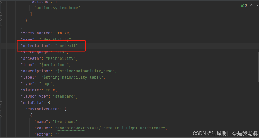
设置为竖屏
打开
config.json添加
"orientation": "portrait"
unspecified:未指定方向,由系统自动判断显示方向。landscape:横屏。portrait:竖屏。landscape_inverted:反向横屏。portrait_inverted:反向竖屏。auto_rotation:随传感器旋转。auto_rotation_landscape:传感器横屏旋转,包括横屏和反向横屏。auto_rotation_portrait:传感器竖屏旋转,包括竖屏和反向竖屏。auto_rotation_restricted:传感器开关打开,方向可随传感器旋转。auto_rotation_landscape_restricted:传感器开关打开,方向可随传感器旋转为横屏,包括横屏和反向横屏。auto_rotation_portrait_restricted:传感器开关打开,方向随可传感器旋转为竖屏,包括竖屏和反向竖屏。locked:传感器开关关闭,方向锁定。
自定义标题
//pages.main.ets
import router from '@ohos.router'
@Entry
@Component
struct Master{
  @State hello:string = "hello this is master page"
  @State inputButton:string = "测试"
  build(){
    Column(){
      Button(this.inputButton,{ stateEffect: false }).backgroundColor("#F5F5F5")
        .fontColor("#DCDCDC").width(200).height(35).onClick(()=>{
        router.push({
          url: 'pages/main_search'
        })
      })


    }.height('100%').width('100%')
  }
}
点击后跳转
pages/main_search页面
@Entry
@Component
struct main_search{
  controller:TextInputController = new TextInputController();
  build(){
    Navigation(){
      TextInput({text:"",placeholder:"测试",controller:this.controller}).placeholderColor(Color.Gray)
    }
  }
}
但出现

为了平齐我们需要自定义标题栏
@Entry
@Component
struct main_search{
  controller:TextInputController = new TextInputController();

  @Builder title(){ // 自定义标题栏
    Row(){
      TextInput({text:"",placeholder:"测试",controller:this.controller}).placeholderColor(Color.Gray)
    }
  }

  build(){
    Navigation(){

    }.title(this.title())
  }
}
Tabs&TabContent
Tabs官方文档
TabContent官方文档
Tabs
不支持自定义组件作为子组件, 仅可包含子组件TabContent
格式为
//需要添加@State currentIndex:number = 0
Tabs({{barPosition: BarPosition.Start, index: this.currentIndex,controller:this.tabs_controller}}){
	TabContent(){
	}.tabBar({icon:<string>,text:<string>})
}
其中
icon就是索引,text是名称
barPosition: 设置Tabs的页签位置。默认值:BarPosition.Start(左侧)还可以设置为BarPosition.End(右侧)index: 显示当前索引值controller:Tabs的控制器必须要有,写法@State currentIndex:number = 0
可以自定义
//需要添加
//@State currentIndex:number = 0
//@State fontColor: string = '#182431'
//@State selectedFontColor: string = '#007DFF'

@Builder tabBuilder(index:number,name:string){
	Column() {
      Text(name)
        .fontColor(this.currentIndex === index ? this.selectedFontColor : this.fontColor) //当前那个索引被选中更改颜色
        .fontSize(16)
        .fontWeight(this.currentIndex === index ? 500 : 400) //选中和没选中更改字体粗细
        .lineHeight(22)
        .margin({ top: 17, bottom: 7 })
      Divider()
        .strokeWidth(2)
        .color('#007DFF')
        .opacity(this.currentIndex === index ? 1 : 0)
    }.width('100%')
}
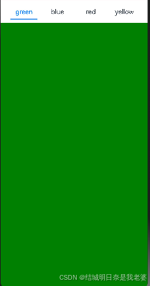
你可以这么写
Tabs({{barPosition: BarPosition.Start, index: this.currentIndex,controller:this.tabs_controller}}){
	//绿色整体
	TabContent(){
		Column(){}.width('100%').height('100%').backgroundColor(Color.Green)
	}.tabBar(this.tabBuilder(0,"green"))
	//蓝色整体
	TabContent(){
		Column(){}.width('100%').height('100%').backgroundColor(Color.Blue)
	}.tabBar(this.tabBuilder(0,"blue"))
}
通过divider实现了分割线各种属性
Divider()
        .strokeWidth(2)
        .color('#007DFF')
        .opacity(this.currentIndex === index ? 1 : 0)
        //.margin({ top: 7, bottom: 0 }) //可以对分割线位置进行修改
图片下载
我的图像SVG
<svg t="1727174544161" class="icon" viewBox="0 0 1024 1024" version="1.1" xmlns="http://www.w3.org/2000/svg" p-id="1537" width="200" height="200"><path d="M1024 512c0-281.6-230.4-512-512-512S0 230.4 0 512s230.4 512 512 512 512-230.4 512-512z m-512 448c-249.6 0-448-198.4-448-448s198.4-448 448-448 448 198.4 448 448-198.4 448-448 448z" fill="#777777" p-id="1538"></path><path d="M627.2 505.6c44.8-38.4 76.8-89.6 76.8-153.6 0-108.8-83.2-192-192-192s-192 83.2-192 192c0 64 32 115.2 76.8 153.6-102.4 44.8-172.8 147.2-172.8 262.4 0 19.2 12.8 32 32 32s32-12.8 32-32c0-121.6 102.4-224 224-224s224 102.4 224 224c0 19.2 12.8 32 32 32s32-12.8 32-32c0-115.2-70.4-217.6-172.8-262.4zM512 480c-70.4 0-128-57.6-128-128s57.6-128 128-128 128 57.6 128 128-57.6 128-128 128z" fill="#777777" p-id="1539"></path></svg><svg t="1727174544161" class="icon" viewBox="0 0 1024 1024" version="1.1" xmlns="http://www.w3.org/2000/svg" p-id="1537" width="200" height="200"><path d="M1024 512c0-281.6-230.4-512-512-512S0 230.4 0 512s230.4 512 512 512 512-230.4 512-512z m-512 448c-249.6 0-448-198.4-448-448s198.4-448 448-448 448 198.4 448 448-198.4 448-448 448z" fill="#777777" p-id="1538"></path><path d="M627.2 505.6c44.8-38.4 76.8-89.6 76.8-153.6 0-108.8-83.2-192-192-192s-192 83.2-192 192c0 64 32 115.2 76.8 153.6-102.4 44.8-172.8 147.2-172.8 262.4 0 19.2 12.8 32 32 32s32-12.8 32-32c0-121.6 102.4-224 224-224s224 102.4 224 224c0 19.2 12.8 32 32 32s32-12.8 32-32c0-115.2-70.4-217.6-172.8-262.4zM512 480c-70.4 0-128-57.6-128-128s57.6-128 128-128 128 57.6 128 128-57.6 128-128 128z" fill="#777777" p-id="1539"></path></svg>
信封SVG
<svg t="1727174609255" class="icon" viewBox="0 0 1024 1024" version="1.1" xmlns="http://www.w3.org/2000/svg" p-id="2645" width="200" height="200"><path d="M914.285714 73.142857h-804.571428C51.2 73.142857 0 124.342857 0 182.857143v585.142857c0 58.514286 51.2 109.714286 109.714286 109.714286h804.571428c58.514286 0 109.714286-51.2 109.714286-109.714286v-585.142857c0-58.514286-51.2-109.714286-109.714286-109.714286z m-804.571428 73.142857h804.571428L563.2 497.371429c-14.628571 14.628571-29.257143 21.942857-51.2 21.942857s-36.571429-7.314286-51.2-21.942857L109.714286 146.285714zM73.142857 782.628571V212.114286l285.257143 285.257143L73.142857 782.628571z m80.457143 21.942858l256-256c29.257143 29.257143 65.828571 43.885714 102.4 43.885714s73.142857-14.628571 102.4-43.885714l43.885714-43.885715-43.885714 43.885715 256 256H153.6z m797.257143-36.571429v14.628571L665.6 497.371429 950.857143 212.114286v555.885714z" p-id="2646"></path></svg>